An iOS or Android update can change a screen you shipped without you changing a line of code. If your app builds its UI from UIKit, SwiftUI, Compose, or Material widgets, Apple or Google owns those widget implementations. Codename One does something different. It statically links our lightweight component implementation into your native app. The UI you test is the UI your users keep after the next OS update. An update can still break a platform API or permission contract, but it cannot swap our button implementation for a new one.
Lightweight does not mean a Java paint loop limping behind the platform. On iOS, components paint through our Metal pipeline. The moving Liquid Glass tab lens in this post is a Metal shader on the frame’s existing command buffer, with no transfer of pixels back to the CPU. At the same time, last week’s ParparVM work brought our ahead-of-time VM to geomean parity with warmed Java 25 across ten benchmarks. Six finished at or ahead of HotSpot.
The tradeoff is that our UI does not inherit Apple’s or Google’s latest redesign for free. We have to study it, reproduce the parts that make sense, and test the result. That is work we take on so you can work on your app instead of working for the Apple and Google design teams. You decide when your app adopts a new look. The OS does not decide for you on upgrade day.
The ParparVM and theme-fidelity branches ran in parallel. We wanted them in the same release, but each became too large to merge together safely. The fidelity work took longer. PR #5274 alone reports 53,000 additions across 1,147 changed files. Generated access registries, resources, screenshots, and native goldens account for much of that number, but the scale is still real. Five follow-up PRs fixed what the first pass exposed.
Owning the component stack also lets us work below the pixels. PR #5363 adds a portable accessibility hierarchy, virtual semantic nodes, simulator audits, and platform preference detection. That took 6,965 additions across 57 files because proper accessibility is not a label bolted onto a button. Monday’s post goes through that work.
We will never make every pixel of every Codename One component land in exactly the same place as every native widget on every device. That is a fool’s errand. The useful target is a point where 98% or 99% of people cannot tell which side is Codename One, and where we notice when a later change pulls us away from that level. We are not there on every component yet. These changes get us much closer, and now the gap is measured instead of argued over.
The themes were modern, but they were not finished
We introduced the iOS Modern and Android Material 3 themes in May. They gave new projects a current starting point, but the first iOS implementation used translucent colors where iOS 26 uses a live glass material. Several controls still carried general Codename One geometry. The Material floating action button was a good example: it inherited the old circular shape and icon-derived size instead of Material 3’s fixed 56dp rounded rectangle.
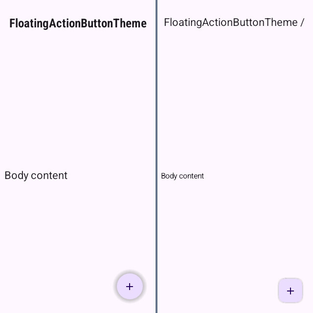
This is the Android floating action button before and after the fidelity pass. The older render is on the left. The current Material 3 render is on the right.
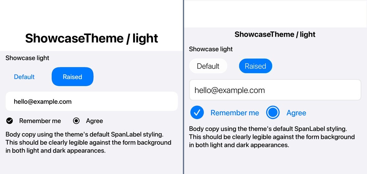
The iOS theme changed just as visibly. Buttons became full capsules, state glyphs moved to SF Symbols, and the sizes and spacing moved toward the iOS 26 references. The May render is on the left and the current render is on the right.
Why is the floating action button still circular on iOS? iOS has no native floating action button equivalent. Importing Material’s rounded rectangle into the iOS theme would make it less native, not more. Android follows Material 3. iOS keeps the established circular accent action until there is an iOS component we can target.
A native app produces the answer sheet
The fidelity suite contains two standalone reference applications. One is written with UIKit and Swift. The other uses Android’s Material components. We run those apps locally on pinned native toolchains and capture real controls in light and dark appearances, including normal, pressed, selected, and disabled states.
Glass needs something behind it. A plain white tile can let a translucent fill pass for blur because there is nothing useful to blur. The glass tests place both implementations over the same photo and gradient backgrounds. That gives the lens edges, refraction, saturation, and backdrop blur real detail to distort. A tinted rounded rectangle cannot fake its way through that comparison.
The native captures are committed as versioned golden sets:
scripts/fidelity-app/goldens/
  ios-26-metal/
  ios-26-metal-anim/
  ios-26-metal-frames/
  android-m3/
  android-m3-anim/
CI never invents the native side. It renders the Codename One component under the matching theme, compares it with the committed native image, and reports both visual and geometric differences. A one-way gate fails if a score drops below its recorded baseline.
iOS 26 simulator"] --> B["Versioned native goldens"] C["Material reference app
API 36 emulator"] --> B D["Codename One fidelity app
rendered in CI"] --> E["Pixel comparison"] B --> E E --> F["Visual score"] E --> G["Geometry metrics"] E --> H["Fixed animation frames"] F --> I["One-way baseline gate"] G --> I H --> I
The iOS golden set is pinned to iOS 26. The Android set is pinned to Material 3 on API 36 at 160dpi. When iOS 27 arrives, we will capture a new ios-27 set, add a theme variant and a CI matrix row, then test both generations until we deliberately retire the older one. We will not silently replace the iOS 26 answer sheet and call the movement an improvement.
What the percentage means, and what it does not
The current Android baseline contains 54 pairs. Its median tolerant visual score is 95.5%. The worst pair is the dark outlined button in its pressed state at 91.25%. The iOS baseline contains 68 pairs with a 94.4% median. Its worst pair is the dark tab bar at 83.45%.
Those percentages are useful for a regression gate. They are not a substitute for eyes, and they are harsher on larger, information-dense components. A button has one label and a compact outline. The tab bar has three glyphs, three labels, a lens, a long glass surface, and far more edges. A small repeated mismatch affects more of the tab image. The tab can score 83.45% even when it looks closer to the native reference than a button scoring above 90%.
Thomas made this point in the PR discussion. A radio button can look identical to a person and still lose points to antialiasing. A large tab bar can hide a wrong icon inside thousands of matching backdrop pixels. A high overlay score can also conceal a wrong width or corner radius.
We changed the suite in response. It now reports bounding-box offsets, width and height ratios, center offsets, and an estimated corner radius separately from the visual score. The comparison mode also comes from an explicit material: normal|glass|lens declaration instead of an image heuristic. Human review remains part of the process, especially for motion and translucent effects where one score can hide the wrong detail.
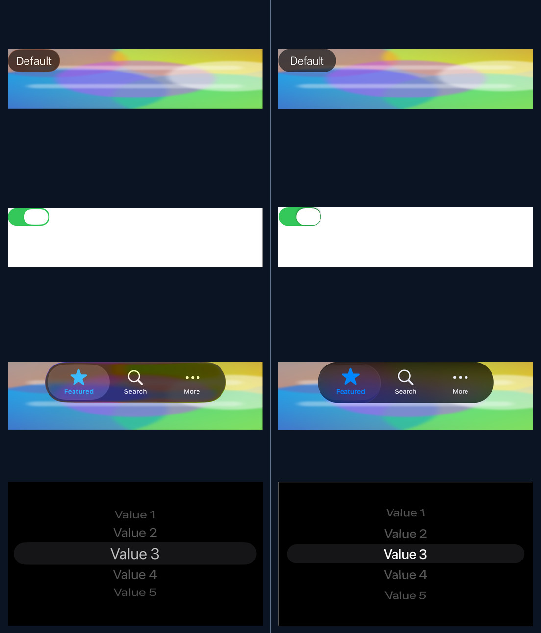
Here are four current iOS pairs from the automated report. Native is on the left. Codename One is on the right, separated by the thin vertical line. The dark picker makes the limitation obvious: the selected row is close, but the off-row contrast still needs work.
The Android report uses the same layout and divider. The floating action button now has Material 3 geometry, while the tab typography and outlined button still show smaller differences that the baseline tracks.
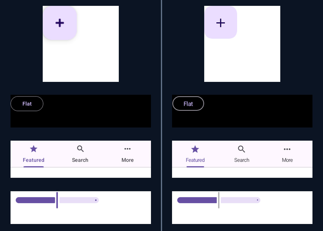
The suite deliberately stops at the component boundary. Screen spacing, hierarchy, and composition are application design decisions whether you use SwiftUI, Compose, or Codename One. The themes should provide sensible defaults that work across devices. The final layout still belongs to the developer building the product.
The tab bar became a rendering project
The iOS 26 tab selection is not a tinted pill sliding under icons. During a touch-driven transition, the selection becomes a magnifying lens. It travels across the bar, refracts the background and glyphs under it, stretches during flight, and settles with a small spring overshoot.
This animation compares the native references with Codename One. The top row is light appearance and the bottom row is dark. Native is on the left. Codename One is on the right.
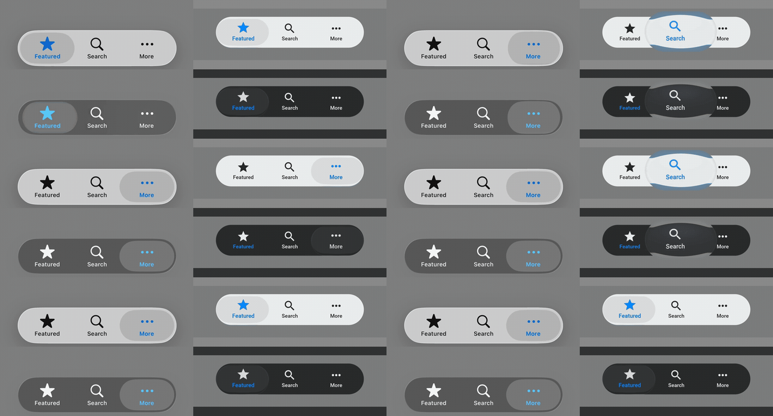
The static comparison below freezes the useful stages so you can inspect the geometry.
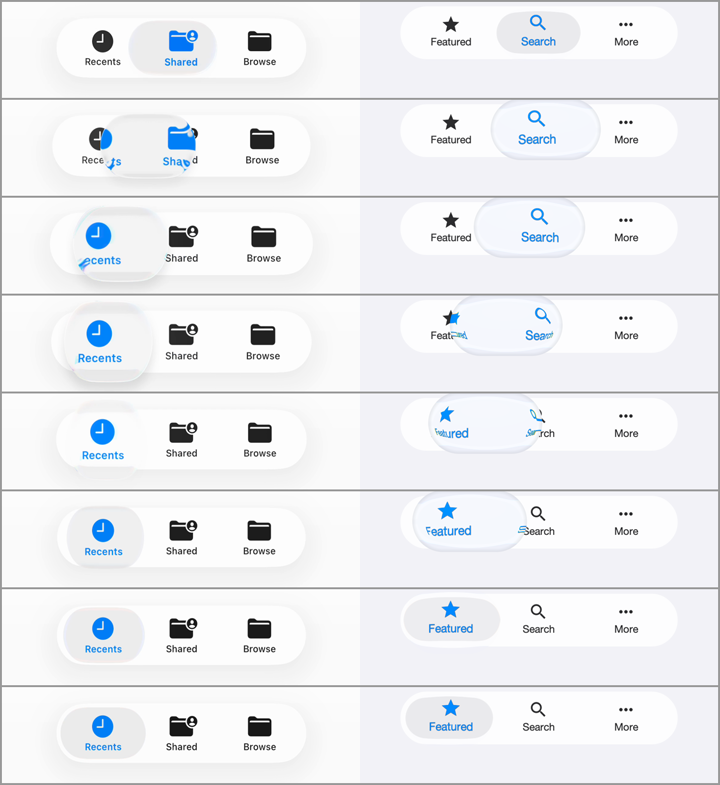
The first native recording sent us in the wrong direction. We changed selectedIndex automatically and captured a flat platter sliding across the bar. That is what UIKit shows for a programmatic selection. The full Liquid Glass lens only appears after a real touch. We eventually caught the difference and built a small XCUITest driver that taps the actual tab bar while the simulator records it. The animation above comes from that touch-driven reference.
The shared motion lives in TabSelectionMorph. It calculates the pill and lens geometry for each frame from the old tab, the new tab, and the current touch progress. The result also carries the magnification, color separation, tint, and spring settle. Tabs paints it. SwitchThumbDroplet does the same job for the glass switch thumb, including the stretch and vertical squash during travel.
The public theme surface is intentionally smaller than the internal model. A theme selects tabsMorphPreset: ios26 or subtle, then adjusts duration, lens intensity, and spring percentage. Thirteen low-level motion constants from the first implementation were removed because they made it too easy to tune one screenshot while breaking the path between screenshots.
The test freezes the animation at 0%, 10%, 25%, 50%, 75%, 90%, and 100%. It checks that the frames are distinct, travel is monotonic, and overshoot stays bounded. The committed intermediate frames are Codename One goldens, not native intermediate-frame comparisons. We still review native motion from the captured video because the intermediate frames are not compared automatically yet.
Glass is a typed material, not a pile of constants
The first glass pass exposed saturation, blur, scale, offset, refraction, and specular values as unrelated theme constants. That did not look good. A toolbar, panel, button, and moving lens could each be tuned into a different material by accident.
GlassRecipe now defines four bounded material intents:
GlassRecipe.plainBlur();
GlassRecipe.liquidChrome(dark);  // edge bars and toolbars
GlassRecipe.liquidPill(dark);    // floating tab bar
GlassRecipe.liquidPanel(dark);   // general glass surface
The theme assigns a recipe to a UIID. Component resolves it and passes the parameters through Graphics.glassRegion(...). Ports receive a material recipe instead of reading iOS-specific constants during paint.
On iOS, the moving lens is a Metal fragment shader on the frame’s existing command buffer. It does not transfer pixels from GPU memory back to the CPU. The larger glass patch does need backdrop pixels, so it uses a cache keyed by bounds, recipe parameters, and a hash of the actual backdrop bytes. In a profiled suite run, full composition averaged about 90ms when the backdrop changed and a stable cache hit averaged 5.3ms, with 475 hits and 253 misses. That is development instrumentation, not a general app benchmark, but it gave us a concrete cache policy.
JavaSE originally had no glassRegion implementation. It silently reduced the bar to a plain blur, leaving the lens to magnify a gray slab. JavaScript discarded the material parameters and used a flat tint plus uniform zoom. PR #5388 implements the material on both ports and pins 14 constants across JavaScript, JavaSE, the iOS CPU reference, and the Metal shader. The JavaScript lens now produces the same pixel CRC as JavaSE at all seven probe points.
There is still a platform tradeoff. The iOS path uses the native Metal shader. JavaSE and JavaScript reproduce the pixels in software. They do not get the same GPU path, so a complex moving backdrop can look less smooth there. The component and its state model remain portable. The implementation cost is not identical.
CSS had to grow with the themes
Several differences could not be fixed by editing a color. The framework and CSS compiler gained new vocabulary:
#Constants {
    tabsMorphPreset: "ios26";
    buttonReleaseFadeDurationInt: 180;
    tabsEqualWidthBool: true;
}

RaisedButton {
    cn1-background-type: cn1-pill-border;
    border: 0.1mm solid rgba(136,254,255,0.58);
    cn1-stroke-gradient: #ffffff;
    cn1-stroke-gradient-angle: 135deg;
}
RoundBorder now supports a gradient stroke. Button gained an opt-in release overlay so iOS Modern can fade the held state over 180ms instead of snapping it away. Dialog and InteractionDialog gained opt-in centered-title layouts while keeping command rows flush with the card edges. Tabs gained equal-width cells and a correctly scaled Material indicator. Style gained letter spacing. Resource format revisions carry gradients, filters, and gradient strokes into the shipped .res files.
The icon problem also needed a platform answer. Material icons looked wrong inside iOS controls even when their meaning was correct. FontImage.createSFOrMaterial(...) selects an Apple SF Symbol on iOS and the Material fallback elsewhere. Toolbar commands can now hide their text visually while retaining the command title for accessibility.
The follow-ups matter as much as the headline PR:
- PR #5373 restored application accent bindings that the first fidelity pass accidentally replaced with fixed colors. The regression also exposed a test that could accept default colors after a retry, so the test was fixed too.
- PR #5379 added the iOS 26 button capsules, the 180ms release fade, and gradient strokes.
- PR #5376 added opt-in centered dialog-title layouts and fixed edge-to-edge command grids in both dialog classes.
- PR #5387 tightened toolbar icons, spinner contrast and insets, slider thumbs, progress tracks, disabled switches, and glass-panel corners.
- PR #5388 brought JavaSE and JavaScript glass rendering back in line with the shared model.
The suite also found a 14-year-old iOS gradient bug. The on-screen fillLinearGradientGlobal path had horizontal and vertical axes reversed since 2012. The mutable-image path was correct. A controlled gradient backdrop finally made the difference attributable.
Most of the week was invisible backend work
While the theme diff was easy to photograph, most of our time went into replacing the Codename One account login system.
The new Account Security page puts the controls in one place. You can now sign in with Google or GitHub, enable a time-based two-factor authentication app, register passkeys, inspect active sessions, revoke one session, or sign out every other device. A passkey can use the fingerprint, face, PIN, or other device-unlock method supported by your platform.
This work changes no pixel in your app, but it changes how we protect build credentials, signing assets, and account data. It also removes several account responsibilities from the desktop Settings tool. Saturday’s post explains that smaller tool.
Three smaller changes with large failure modes
Three other PRs deserve a note because each fixes a problem that can waste hours.
Aligned text no longer jumps when editing starts. PR #5374 makes the Android inline editor and JavaSE Swing editor honor getAbsoluteAlignment(). A right-aligned number now stays on the right when the lightweight field hands control to the native editor. Multi-line Swing text areas remain unchanged because Swing has no per-line horizontal alignment there.
Local tooling failures can offer Get Help. PR #5383 adds mvn cn1:get-help after install, project creation, configuration, local run, or build submission failures. Nothing is telemetry and nothing is sent until you press Send. The report includes the failed step, command, Java and proxy environment, and a capped error trace. If you supplied an email, support can reply asynchronously. The UI does not promise round-the-clock live staffing.
A stale class now fails before upload. PR #5390 scans the staged application jar with ASM and verifies that your own package references close over classes that actually exist. The old failure appeared roughly 11,000 build-log lines later as a missing generated Objective-C header. The new failure runs on the client and tells you to run mvn clean.
The compiled application classes are inconsistent.
 - com.example.Gone (referenced from com.example.Caller)
Run 'mvn clean' and rebuild.
The rest of this release series
The fidelity work could fill the week, but five other changes need their own explanations:
- Saturday: Codename One Settings is now a standalone project tool.
- Sunday: Widgets, Live Activities, and Dynamic Island from one Java API.
- Monday: Accessibility semantics and the parallel UI tree.
- Tuesday: How that accessibility tree lets an agent drive a Codename One app over MCP.
- Wednesday: A support matrix generated from current CI evidence.
If you use the modern themes, the most useful thing you can send us is still a screenshot with a precise component, state, appearance, and device. The ratchet stops known pixels from getting worse. It does not tell us which missing screen matters most to you.
Discussion
Join the conversation via GitHub Discussions.